The responsive web design issue
Responsive web design (RWD) aims to cope with the problem of how images and text behave when the size of the screen changes.
As the heights of the image and text vary with the screen size, this type of design ‘responds’ to the change. The user should see a well-designed website whatever device they are viewing from.
“ If you’ve ever designed a responsive website, this is the source of all your sadness. This is the fount of your tears, the wellspring of your suffering.
— Frank Chimero
Test page: wetest.co.uk/rwd
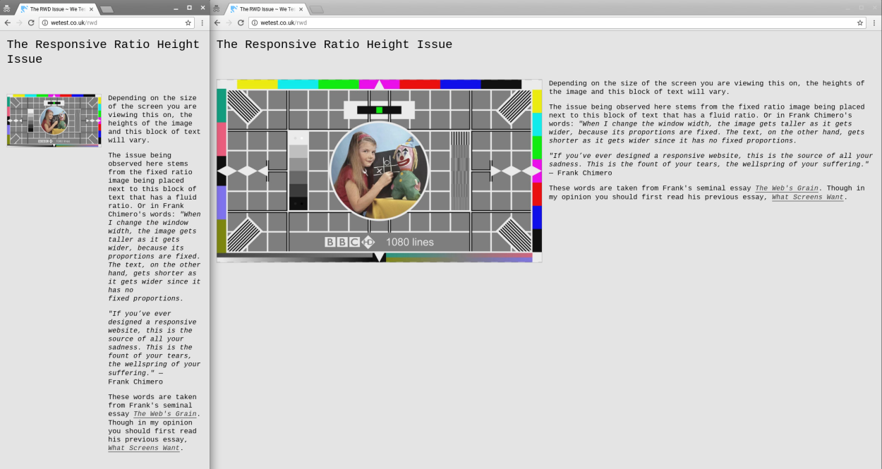
Screenshot of the same website displayed on two screens; one narrow, one wide
The issue being observed here stems from the fixed ratio image being placed next to this block of text, which has a fluid ratio. Or in Frank Chimero’s words: “When I change the window width, the image gets taller as it gets wider, because its proportions are fixed. The text, on the other hand, gets shorter as it gets wider since it has no fixed proportions.
These words are taken from Frank’s seminal essay The Web’s Grain. Though in my opinion you should first read his previous essay, What Screens Want.