Tom Hammick
Tom Hammick is an artist working in a wide variety of mediums, though he's best known for his painting and prints.
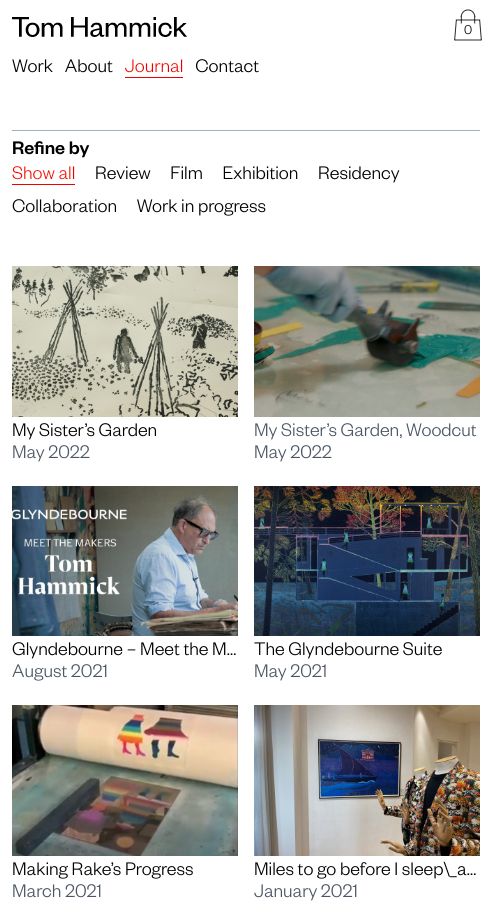
In the Spring of 2020, I was recommended to Tom and his business partner Sophie Ansell, who jointly run the site, by graphic designer Sophie Gibson. Sophie has worked with them for many years on their websites and printed materials. We were to replace their existing site which was showing its age; both in terms of user experience and technical structure.
The aims included:
creating a better overview of the total body of work
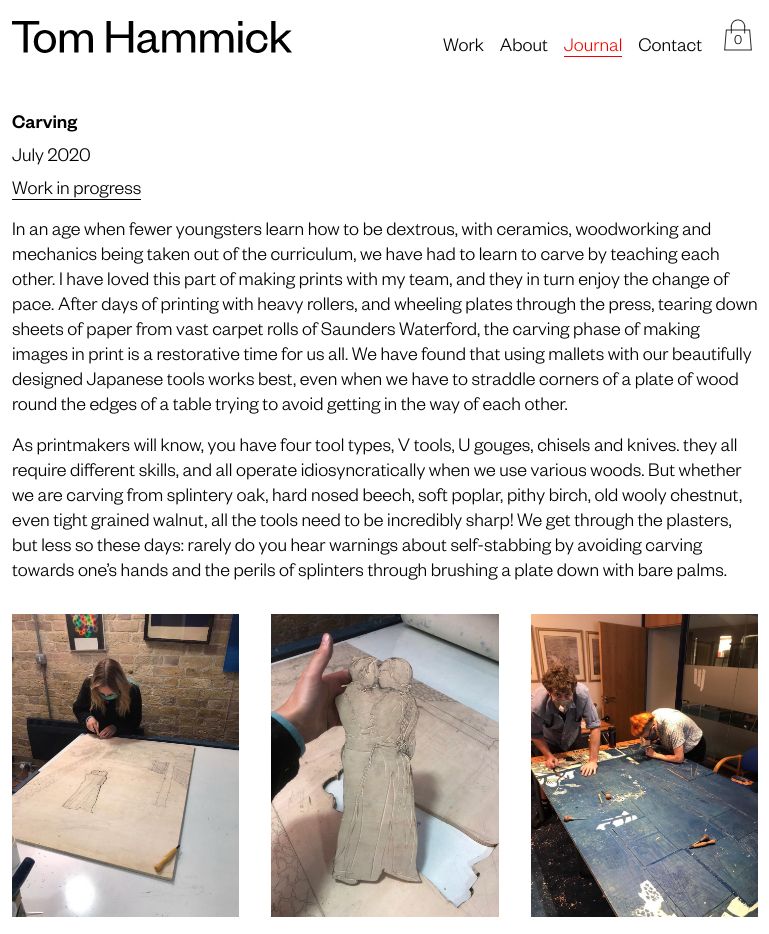
providing greater detail on each piece
using larger, higher resolution images
ensuring a contemporary shopping experience
responsive design
improving the admin experience
In the summer of 2022, we revisited the site to include Tom's paintings. Previously, the work was purposely split with separate websites for paintings and prints. In the course of this merger, updates were made to the underlying software.
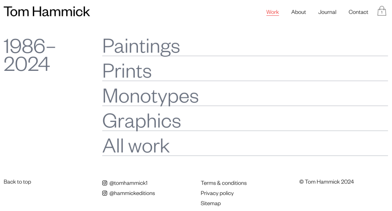
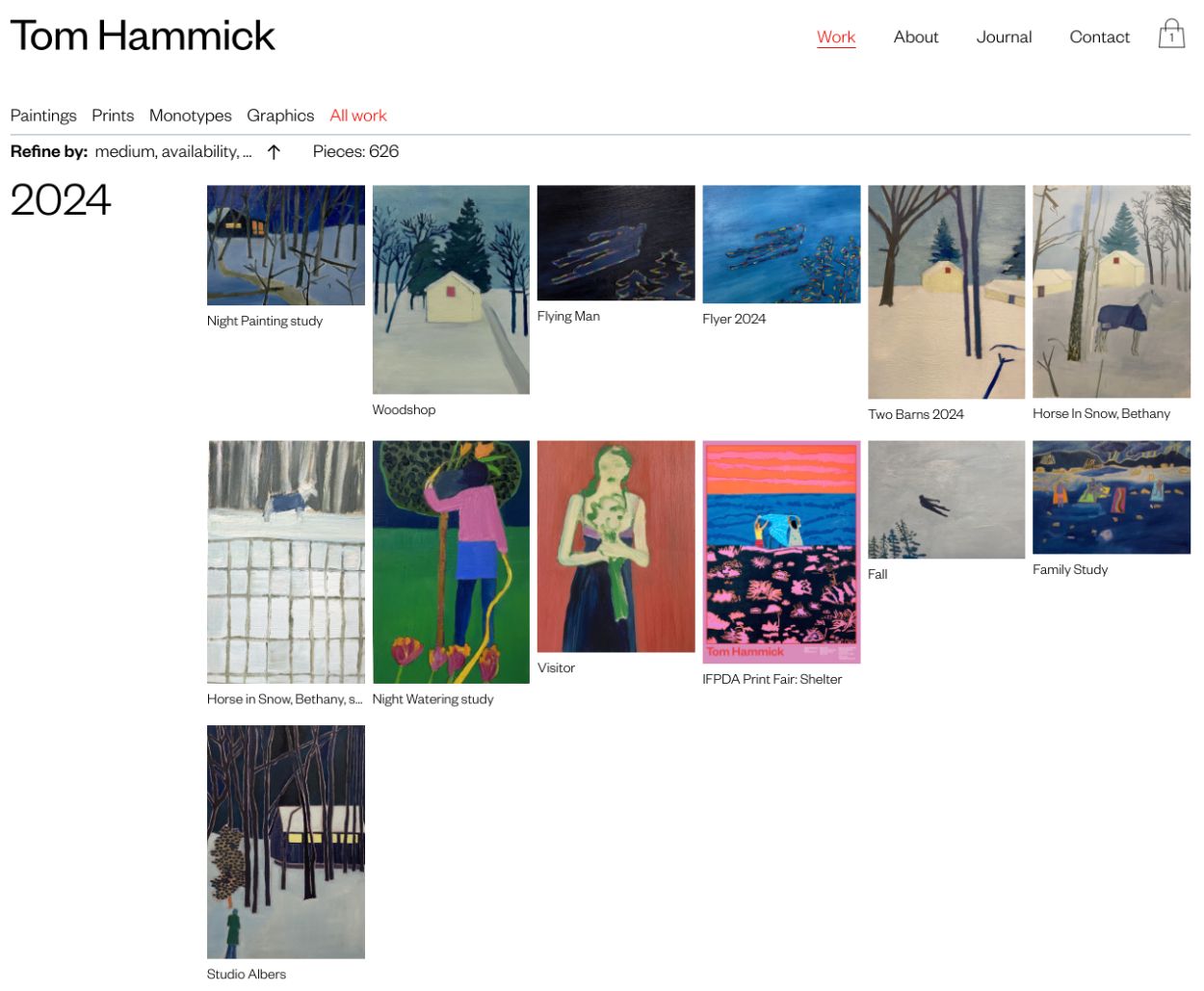
We created the site iteratively over three months evolving the structure for the content, the control panel interface, and the visual design all together. This collaborative and organic approach is certainly my preference and, in my view, provides the most lasting value.
For those interested in the technical stack, Statamic formed the foundation as the CMS (content management system). I once again used Tailwind, a utility-first CSS framework, as it significantly eases developing the site's visual style. This is especially true when one is switching between projects or returning to a project months or even years later. Also, some plain javascript (ie not a framework) has been used for filtering on the index of work and for zooming into each piece with a loupe when one hovers.
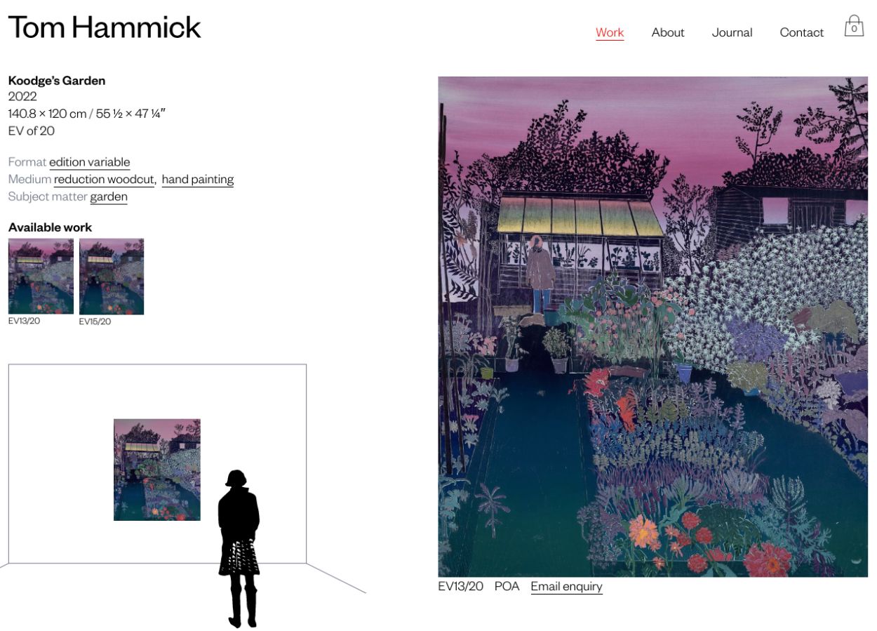
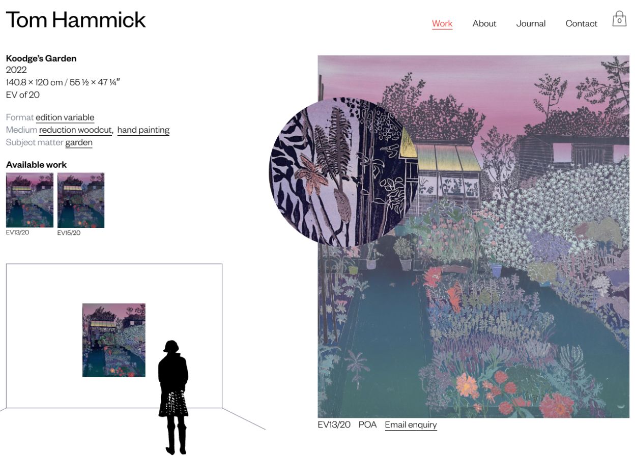
For ecommerce we chose Snipcart as it is full featured, straightforward to integrate (literally functional within a couple of hours) and competitively priced. However, the nuance of good online shopping is in the detail and that can only be achieved through thorough consideration and testing.
As an example, the primary means of pricing a printmaker's work is in the editions. As you'd expect from the art world, these prices are fluid and they likely change as editions sell out. By fully controlling the fields in the CMS and what gets passed to Snipcart, we were able to create this as the business required rather than adapting the business to the tools we were using.
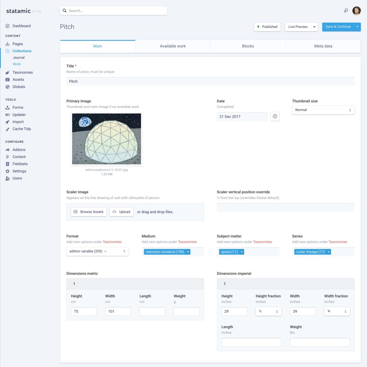
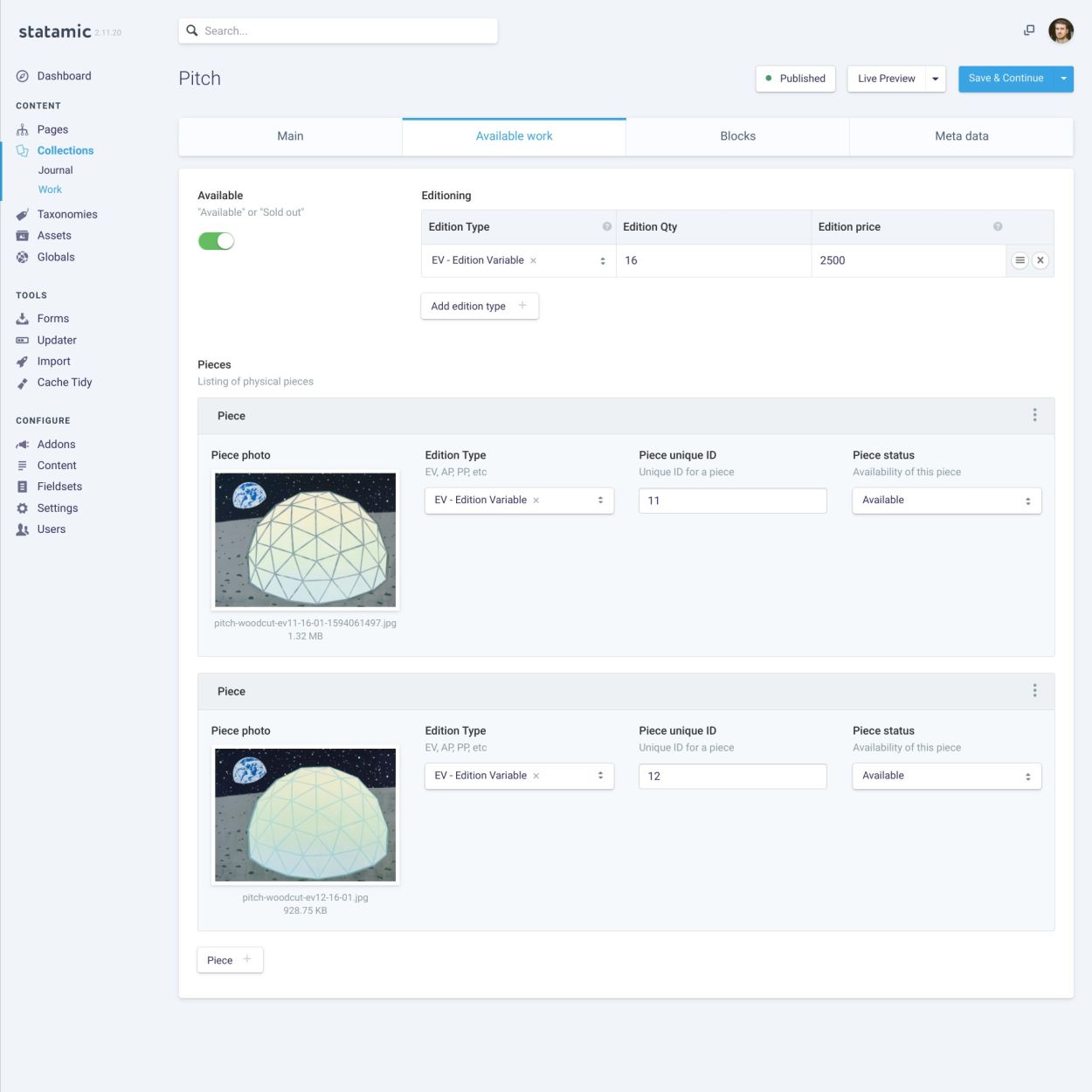
An often underappreciated and fiddly aspect of ecommerce is the notification emails that customers throughout an order process. Snipcart does this well, but it's worth noting that the inconsistencies between email services inherently makes styling difficult. There are strong limitations and it is a slow process to design and test. My advice is to keep it simple and test, test some more, and then send one more test.
Finally, if a site is made to replace something that already exists, it is paramount to manage the existing web addresses appropriately. URLs heavily affect a site's ranking with search engines but they will also impact on anyone who tries to visit a bookmarked page or clicks a link from an old email. The solution is to tell the server where each existing page is now within the new site. For anyone interested, I wrote about this particular configuration in managing legacy URL redirects.
