A checklist for Squarespace
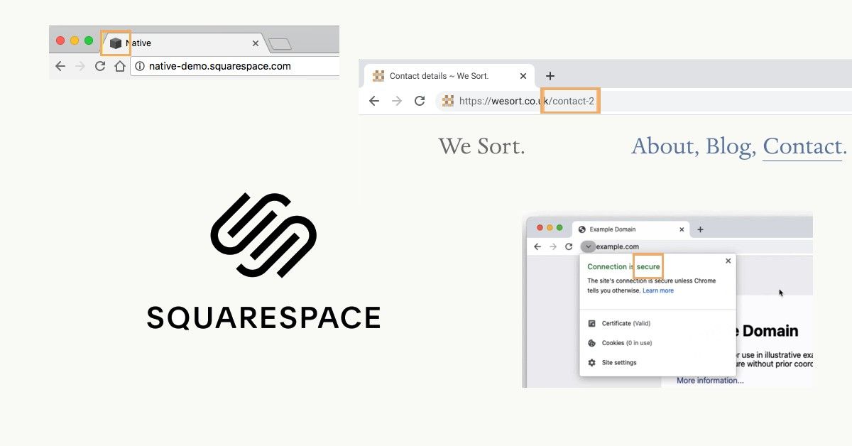
If you’re using Squarespace, here are eight commons things to check. Configuration like turning on SSL, setting a custom favicon, and minding your ‘slugs’.
These aren't specific to Squarespace per se, but I often see these things when someone uses the platform.

Turn on SSL
TL;DR: Turn on SSL
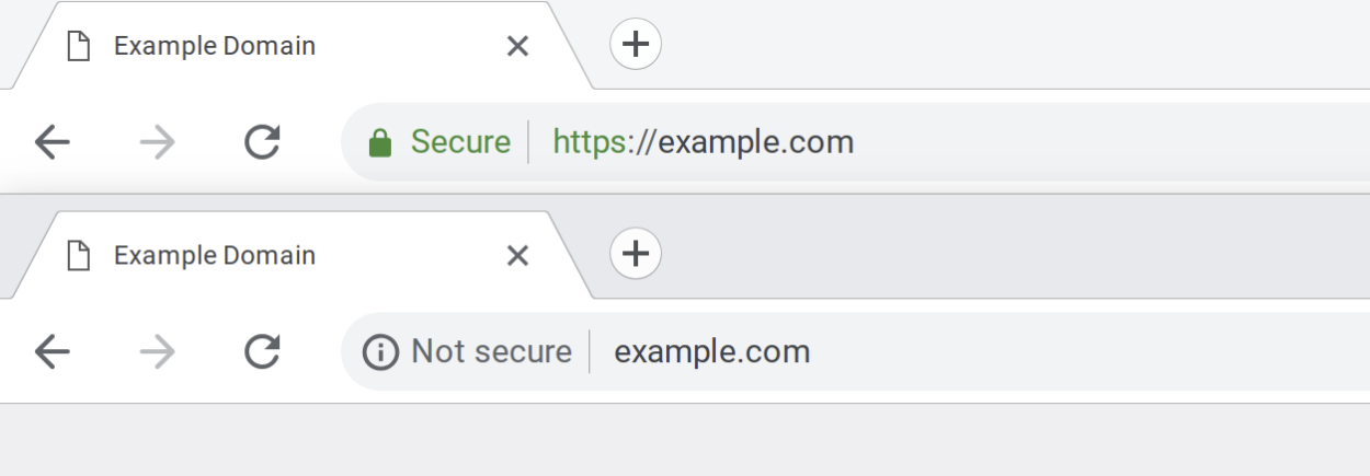
SSL or TLS are technologies that mean a browsers connection to a server is secure and encrypted. For most users, this means seeing a padlock (and not seeing "Not secure") in the address bar.

Set a custom favicon
TL;DR: Create a 32×32px .png and upload it to replace the default Squarespace cube
Favicons, shortcut icons or bookmark icons are the little images that are displayed on the browser's tab. They visually represent the website's brand in an extremely distilled context. Presented at 16px square, there isn't much room but it's an opportunity to express who you are with colour, graphics and maybe a couple of letters.
This same brand asset is also useful for social media accounts.
For inspiration, Responsive Logos was created a few years ago and it's fascinating to see how various global brands adapt their logo across different sized contexts.
Mind your slugs
TL;DR: Check that each page has a human readable URL that represents the page
The slug is the last segment of a URL. It's part of what makes every web address unique and is typically a slugified (only lowercase letters, numbers and hyphens - no spaces, no special characters) version of the page title.
Sometimes in the process of making a site we create alternate versions of a page. Because each page needs to be unique, if you're creating another Contact page Squarespace will append "-1" onto it so that you end up with: example.com/contact-1.
Set the slug correctly, and delete redundant pages.
Ensure you have meta descriptions
TL;DR: Write a summary that is no more than 150 characters for each page.
This short bit of text is critical for users and SEO. It appears in search results, link previews and elsewhere. It happens to be a very fruitful exercise in understanding and refining your content too. I find metatags.io helpful as a testing tool AND for its explanations of this realm.
Social links & placeholder content
TL;DR: Ensure things like social links are correct or remove them.
Many sites built from a theme end of launching with placeholder content still in there. The footer is a commonly overlooked region with social links either being dead links or the site name being generic.
Email and telephone links
TL;DR: Set email addresses and telephone numbers as links.
Just make it easier for your visitors to click to use these.
email:
<a href="mailto:hello@example.com">hello@example.com</a>phone:
<a href="tel:+447900123456">+44(0)7900 123 456</a>
Alt text
TL;DR: For every image, write a description
Alt text is helpful to the visually impaired and to SEO ranking. It's a brief description of what's in the image and writing it is nuanced.
Social sharing images
TL;DR: Add a social sharing image to each page.
As with meta descriptions, these enrich your content when a URL is shared. Again, I find metatags.io helpful to do this and they recommend 1200×628px as the size to upload.
For what it's worth, Squarespace also has their own SEO checklist.
There are various site crawling and analysing tools out there to check how your site performs, here are a few:
PageSpeed Insights (aka Lighthouse by Google)
WebPageTest, by Catchpoint