Images for websites
https://wesort.co.uk/blog/writing/images-for-websites
It has never been a simple answer when I’m asked about getting images ready for a website. It has always had quite a bit of ‘it depends’ as there are so many factors.
What’s important, is ending up with a site that has crisp, quality images whilst still being fast regardless of the user’s context.
TL;DR = 2500px jpg with a ‘good’ filename
last updated: 25 June 2020
Some standards or defaults:
Original photo: Start with the highest quality image you can get. Ideally what the photographer was happy with after they did any post-processing, touch-ups and colour correction.
File type: if the image was made by a camera, it’s pretty much going to be a jpg.
Filenames: use only lowercase, no spaces (use hyphens), no special characters, include some identifying info (project name, subject matter), finish with a unique number suffix.
- bad: photo.jpg or DSC_5325.jpg
- better: river-in-the-woods-01.jpg or river-in-the-woods-DSC_5325-01.jpg
NB: Hyphens also make things easier for keyboarding though filenames. Did you know you can jump to the next word (ctrl or option + arrow keys)? Underscores join up the words while hyphens don’t.
In more detail:
- To understand how images should be processed, one needs to consider where they’ll be used. In particular, the layout size. Over the years I’ve tended to write CSS from scratch – reusing what came before on recent projects. More recently, I switched to using Tailwind CSS which is a framework that enables me (and other developers who I collaborate with) to make websites faster, more robust and more easily maintainable. More maintainable in this context means ease of switching between projects and coming back to things in a few months or years. And all that makes websites cheaper and less stressful for everyone.
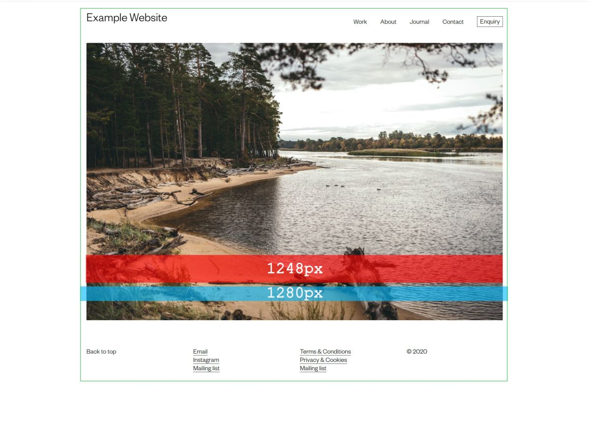
- One tends to set a maximum width on websites to ‘contain’ the site. Otherwise it can become unreadable (long line length) or unwieldy on large screens.
- Tailwind has a well considered set of defaults and one of these is max-width 1280px. This dimension is a common monitor resolution - or more precisely, it is half of 2560px which is a common HD screen size. This size feels right for most of the sites I make.
- Within the max-width we add a bit of space to take the images off the edge (though we don’t need to if we want ‘full bleed’) which I tend to set at 1rem (16px) either side.
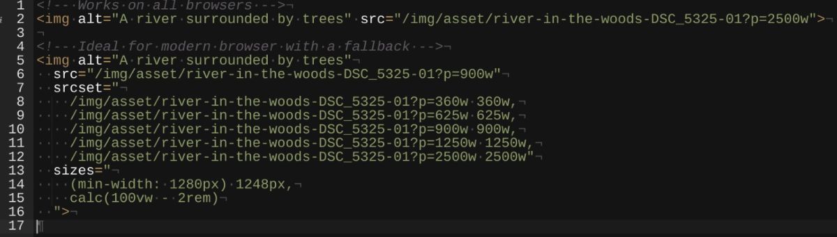
- This gives us a final content size of 1248px that a full width image could fill. Double that for HD screens and you get 2496px – my suggestion of 2500px is a practical rounding.
Staying fast with srcset & sizes:
- Images in HTML are done these days with a ‘set’ of images at different sizes which allows the browser to select which one to download. This selection is made algorithmically based on: viewport size, screen resolution (SD or HD), the layout size of the image (full width or ½ width) and even bandwidth or connection speed.
- The HTML img tag can now be written now using srcset (the images available for the browser to select from) and sizes (the layout size of images within the design). Ideally, we can use the server or CMS to generate the various required images that need to be made from the single source image that we upload.
- I still refer to this technical explanation by Eric Portis (2014) sometimes when trying to wrap my head around setting the values and calc()’s for sizes.
- This is all further complicated by having controls in the CMS to set an image’s layout size at different breakpoints. I won’t go into that here, but maybe that’s another post.
- All images on the web should suitable alt text. This is used by screen readers, SEO bots and visitors will see it if an image fails to load for any reason. It should describe the content of the image, shouldn’t be prose and shouldn’t be stuffed with keywords. Tell me what the image is as though I was on the other end of a phone call. This article Alt-texts: The Ultimate Guide, by Daniel Göransson, has a great user-first level of detail.
In summary:
All this is done to achieve a far better experience for users – quality, crisp images balanced with performance. A visitor on a low resolution mobile doesn’t have to download a 2500px (2000KB or 2MB) image but instead gets a 360px (12KB or 0.012MB).
This adds up significantly when there are multiple images on the page. Especially when images are the vast majority of what users have to download to visit a website.
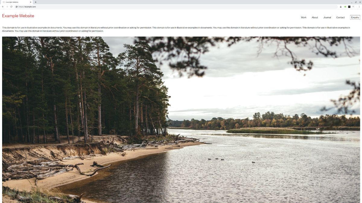
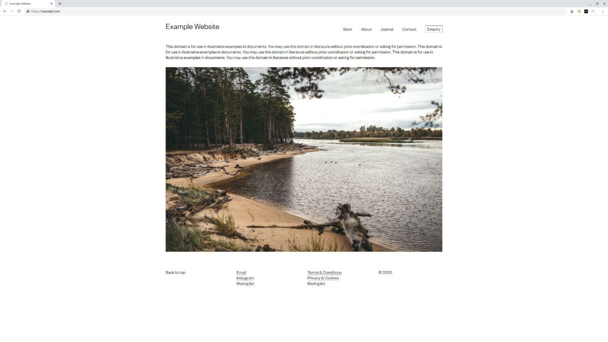
Image courtesy of Mareks Stein via Unsplash.com.