Colophon
To develop this company and this website I’ve had a lot of help.
Since the beginning I’ve discussed, considered, refined and tweaked the words, visual identity and marketing assets of We Sort. Getting this right ensures I’m proud of what We Sort is and how it operates, but more importantly it’s given my customers and colleagues a firm understanding of what I offer.
Brand identity
Stylo Design was instrumental in the early days by helping me find my name. I knew I wanted a separate business name to my own name, but it had to be practical, approachable and confident. They also created our logotype using the Dante typeface.
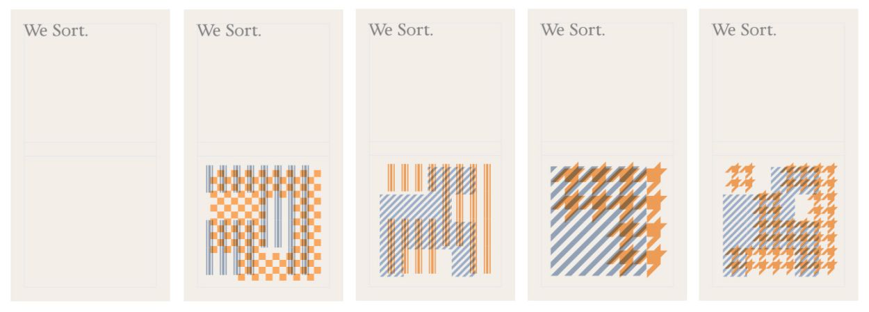
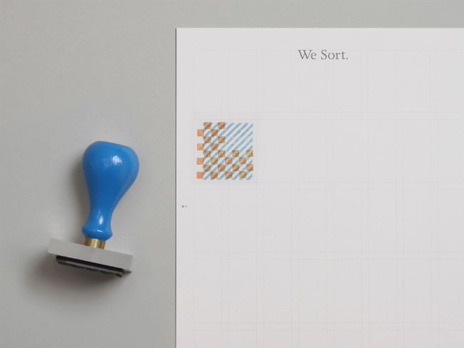
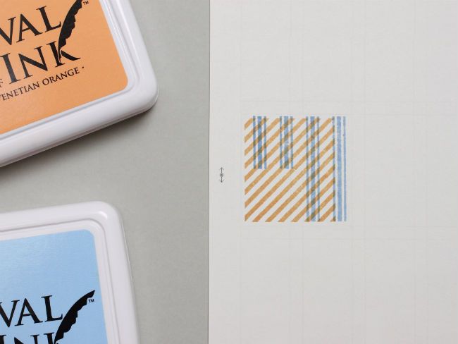
Darren Wall developed the visual identity, which has remarkable flexibility. Using typography, grids, two colours and a system of overlapping patterns, the identity expresses some graphic style to complement the services I offer. The patterns of the identity reflect the pragmatic, hands-on way I work and, most importantly, I like the way they look. They include check, stripe, ticking and houndstooth and are applied on business cards and letterhead as two separate coloured stamps.
In 2025, the identity evolved further alongside designer and collaborator Dave Smyth. We chose a font I preferred (from a better foundry), worked on use of colour, and worked on bringing the ‘stamps’ into use on the web.
abcdefghijklmnopqrstuvwxyz
ABCDEFGHIJKLMNOPQRSTUVWXYZ
0123456789
.,’!?”@%&£$€#[({—})]
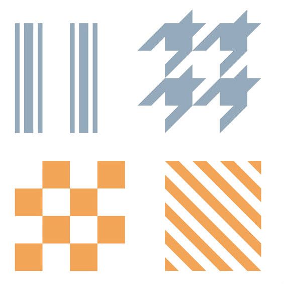
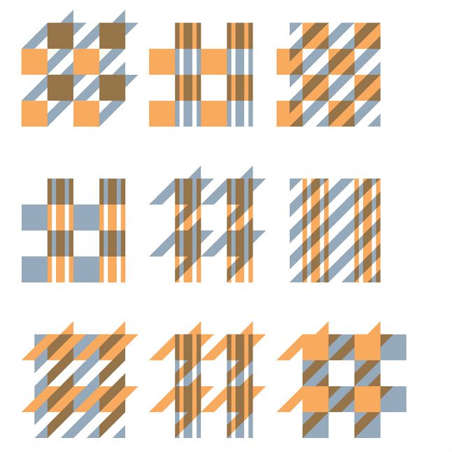
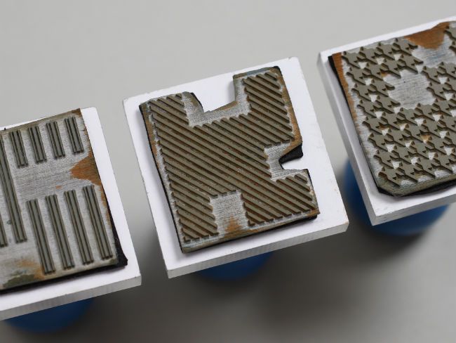
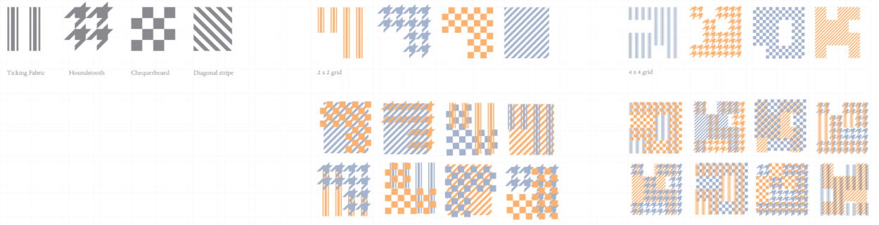
Raw patterns and the two scales of use
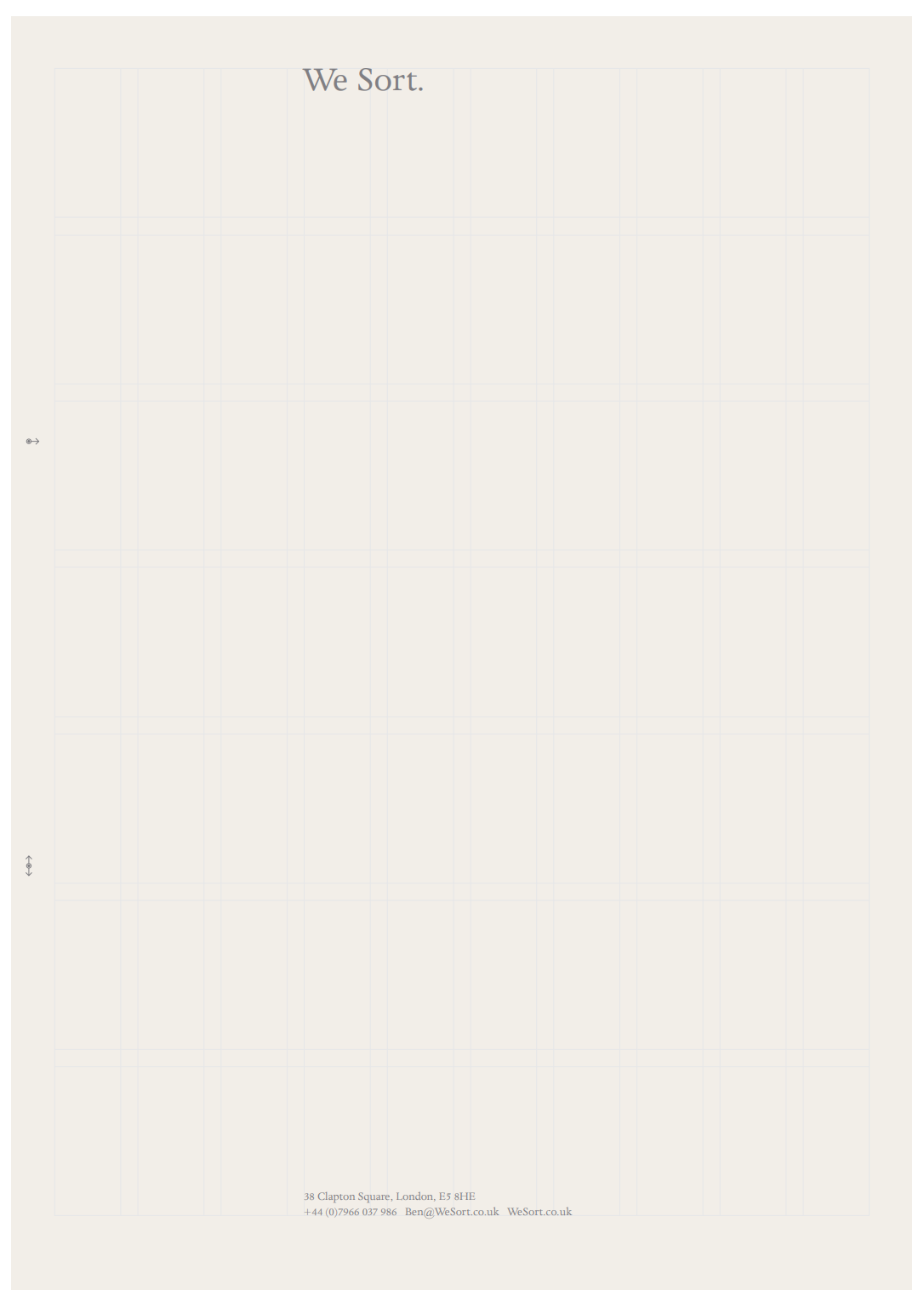
Blank letterhead as delivered from printer
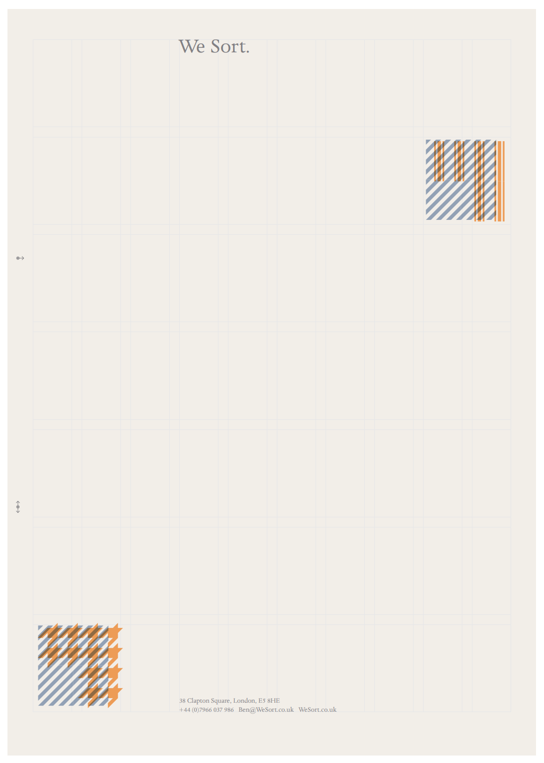
Final letterhead using physical inked stamps